How to ReCode
28 April 2014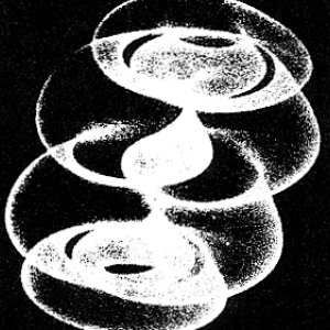
To make it slightly more challenging, the original material looks like it was run through a cheap photocopier a couple of times. Weee.
I came across a link to the project... hm, who knows. Probably some awful site with lots of comments. I hadn't done any work with processing at that point. Obviously the thing to do was participate.
I think the art on there can be placed along a sort of "pain in the ass" gradient, from most to least:
- The art uses some preexisting bitmapped artwork. Like a picture of some guy. Without the picture, it'll be hard to duplicate. One of them clearly uses a different photo. I'm far too particular to do that.
- One step up, the art uses some nonobvious data. Or maybe it was just random. There isn't much difference. So you could generate a bunch of random things which are all in the same style, but never exactly the same thing. If I wanted to do that, I'd be playing with context free.
- Further along that path, the art uses obvious data. Such as US population density. That's actually kind of tempting.
- Finally, we reach the nice "easy" pieces, which are almost purely geometric. Like Sture Johannesson's "Topographic Form", which ended up being the piece I chose to work on.
I looked at it for awhile, screwed around some, probably did a little bit of whatever I was supposed to be doing. Stuff 'n things.
When I look at that I see a circle, with 270° arcs on either side of it. Hm, nope, I see three arcs. 270°, 360°, 270°. That's easier to deal with.

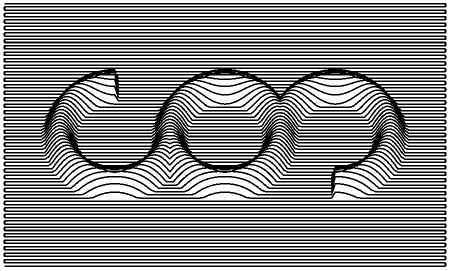
Then a half-circle has been extruded along the lengths of the arcs, producing a 3D volume. We could stop there, and feed that into a ray tracer, and have a nice "realistic" looking image.
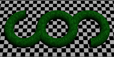
Yeah, about like that! Who doesn't like some nice perfectly smooth jade floating above an infinite checkboard? If you'd like to enjoy some 90's POV-Ray flashbacks, you can play with the source for that image, too.
At this point, you might want to reference
my code. I started with the RaisedArc class, which
represents the arc segments, and computes their height. Just some
trig going on there. Take a point, figure out how high that arc is
at that point.
The draw function can then just drag a "pen" across
the X-Y plane, stopping along the way and asking each arc how high it
is. Take the max, and you reconstruct the surface of the object we
rendered:
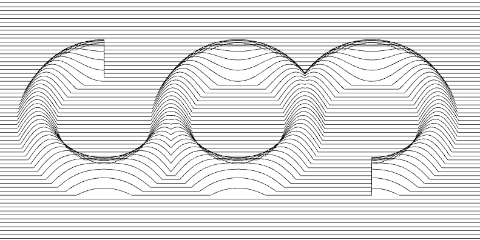
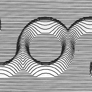
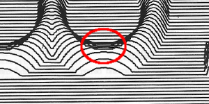
When I hit that, I felt that my decisions up to this point were justified. This felt like the same image, and maybe it is even what the original artist would've wanted to make if they'd had anything close to EGA resolution available. But they didn't. So this image is too "nice", and certainly too smooth. Of particular concern, the truncated ends of the left and right arcs don't even look right anymore. In the original, they actually hint at a bit of perspective, even though I believe the image was rendered orthographically.
"Fixing" the smoothness is taken care of in two steps. First,
we up the step size (fx_step) until the lines are
made of distinct segments. Then noSmooth() turns off
processing's attempts to help us out and make the lines look nicer.
Conveniently, increasing the step sizes makes the truncation of the
arcs much rougher, and gives us the pseudo-perspective appearance.
That's handy because 1) now I don't have to do anything else and 2)
it acts (in my mind) as further evidence that the original was drawn
orthographically instead of in perspective.
I counted the number of horizontal lines in the original, and sort
of eyeballed the other proportions. The fy-0.5 in the
call to computeHeight is to scoot the geometry around
until the lines appear to be falling across it as they do in the original.
The stroke width, and tilt of the X-Y plane were both determined by just fiddling around with things. ...I just noticed that the angle I concocted, of 28.12° is 0.4907 radians. I'm guessing that means the original used a round 0.5 radians. Maybe I'll change that some time. Ehh.
The same "rendering engine" used for this piece could actually be applied
to the map of the United States referenced above. Clip off stuff outside the
borders, and replaced RaisedArc with something that reads a data
file, and bam. That could be fun.
I'm also tempted to do Roger Coqart's From the Square Series. It isn't clear to me that there is a pattern in how the lines are placed, but I think we could get fairly close with some rules about the distribution of line segments. Perhaps adding them at random until they get close to satisfying some rules.